The Bergen people: a city, its history and grand hotel
A photographic essay on medieval architecture, northern light and the hospitality group that takes its name from the city itself.
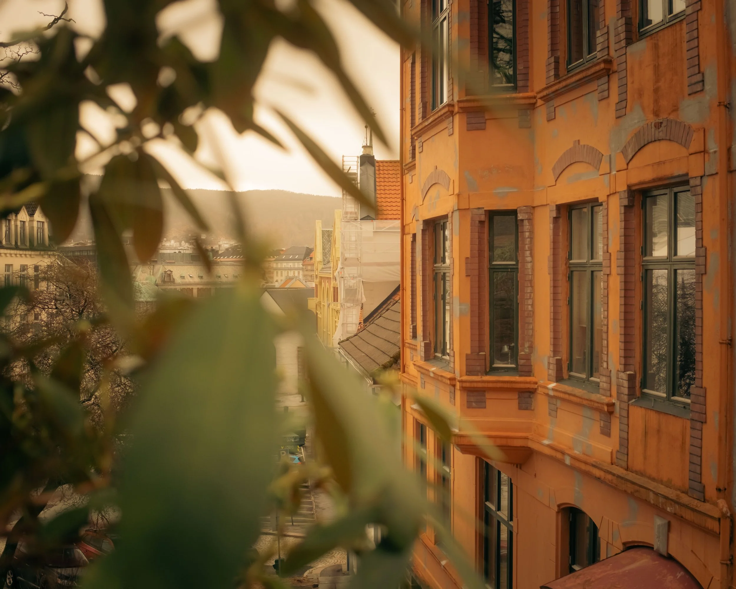
Bergen was founded in 1070 on a narrow corridor of land between seven mountains and the sea. For two centuries it was Norway's largest city and its primary port, the point through which Hanseatic merchants moved stockfish south to Europe and returned with grain, cloth and coin. The trade routes that ran through Bergen shaped not only its economy but the physical logic of the city: the compressed architecture of the wharves, the steep residential streets climbing toward the mountains, the particular density that comes from a city pressed hard against its own geography.
What is less often said about Bergen is that the same geographical pressure produced a city with an unusually coherent visual identity. The seven mountains are not backdrop. They are the reason Bergen looks the way it does, light and weather moving through the bowl they create in ways that shift faster than most Nordic cities experience. Norway has become one of the world's most significant contemporary architecture cultures, and Bergen sits interestingly inside that lineage: a city whose medieval fabric has been extended by architects who understand precisely what northern light demands of a building.
Bryggen and the Persistence of Form
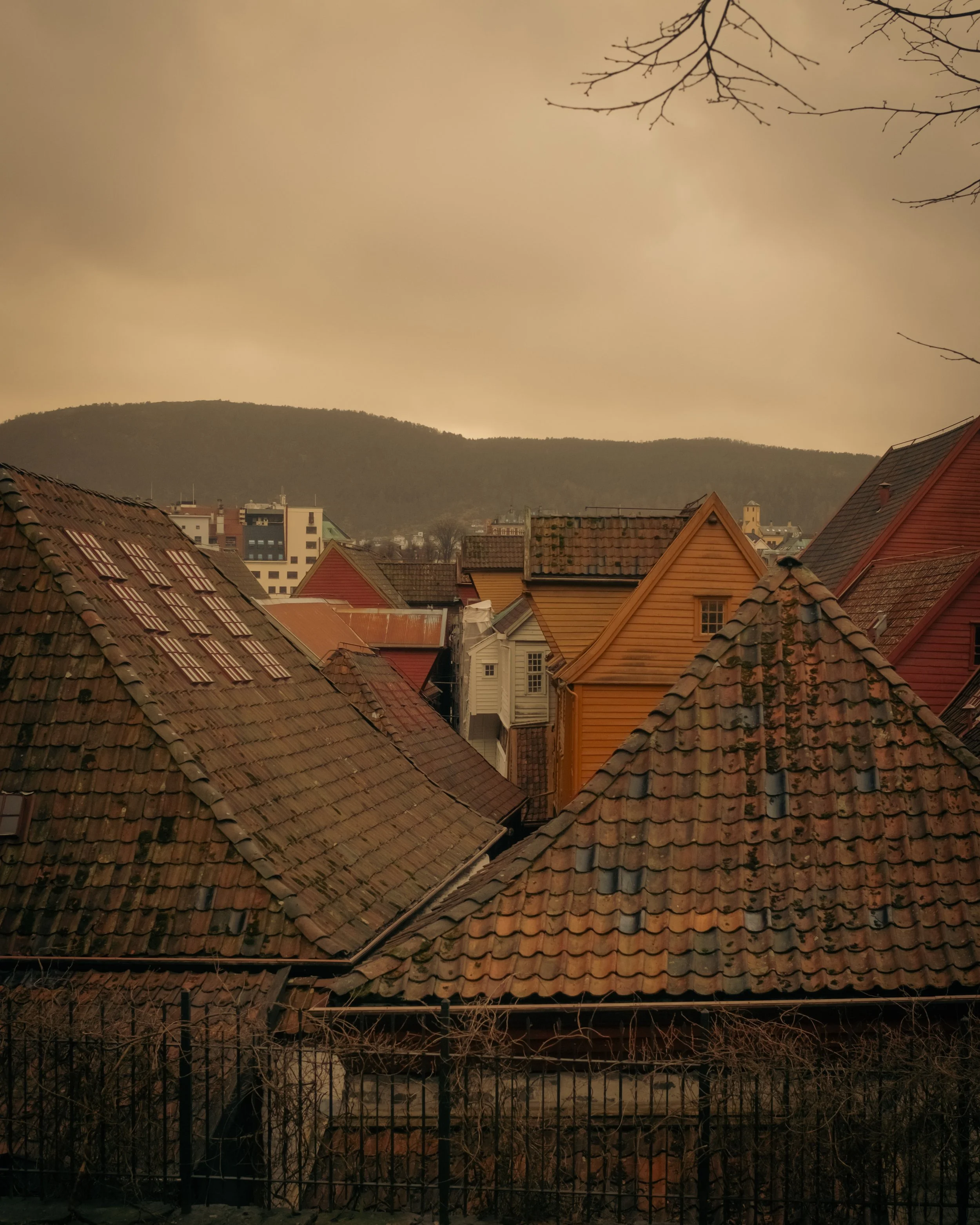
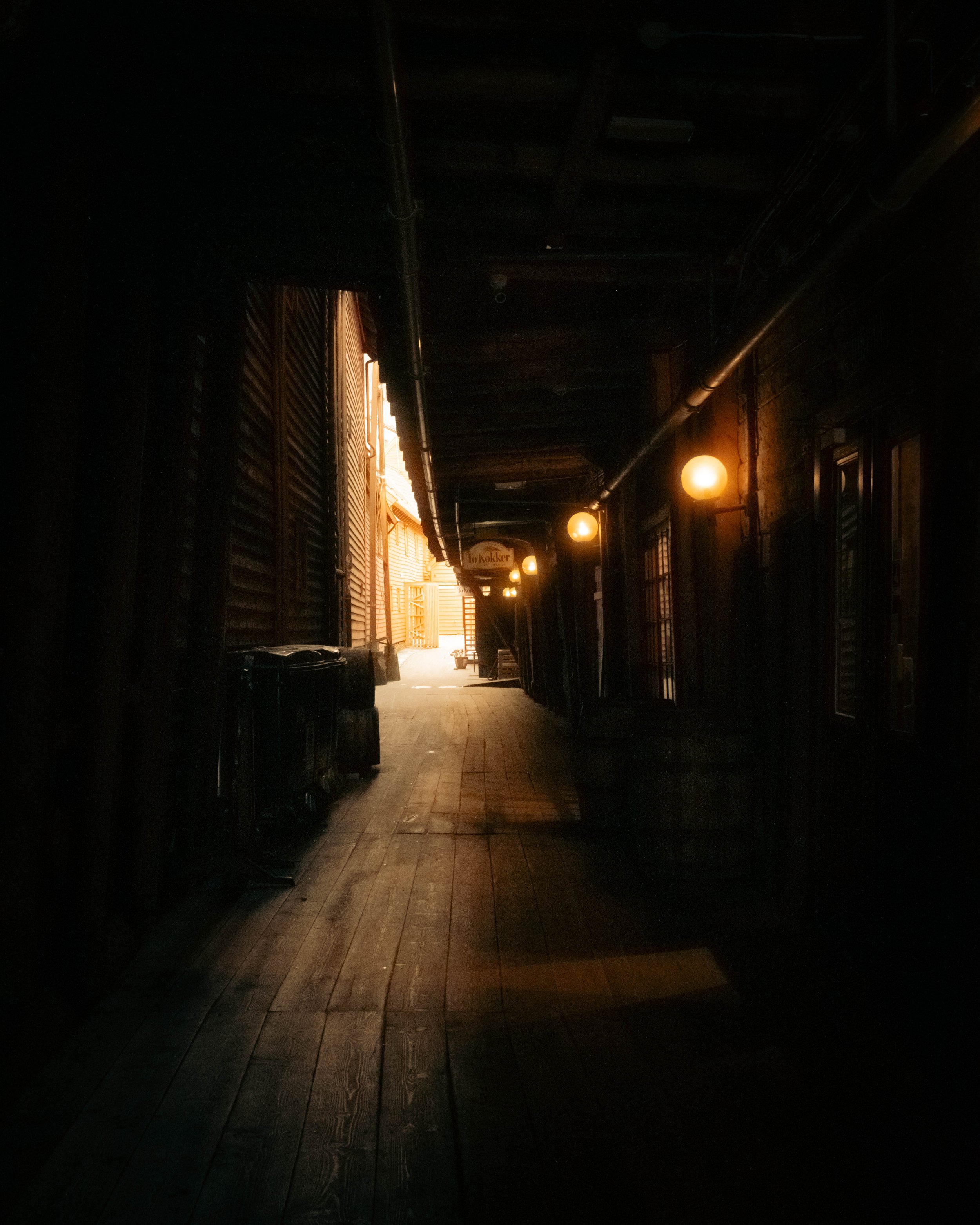
The gabled timber facades of Bryggen have occupied the same wharf since the fourteenth century. They have survived fire, rebuilding and the Bergen habit of continuing to use a structure rather than replacing it. The buildings that stand today are not reconstructions. They are the ongoing result of a city maintaining its form across centuries of active commercial life, now listed as a UNESCO World Heritage site while remaining inhabited and trading along the same waterfront.
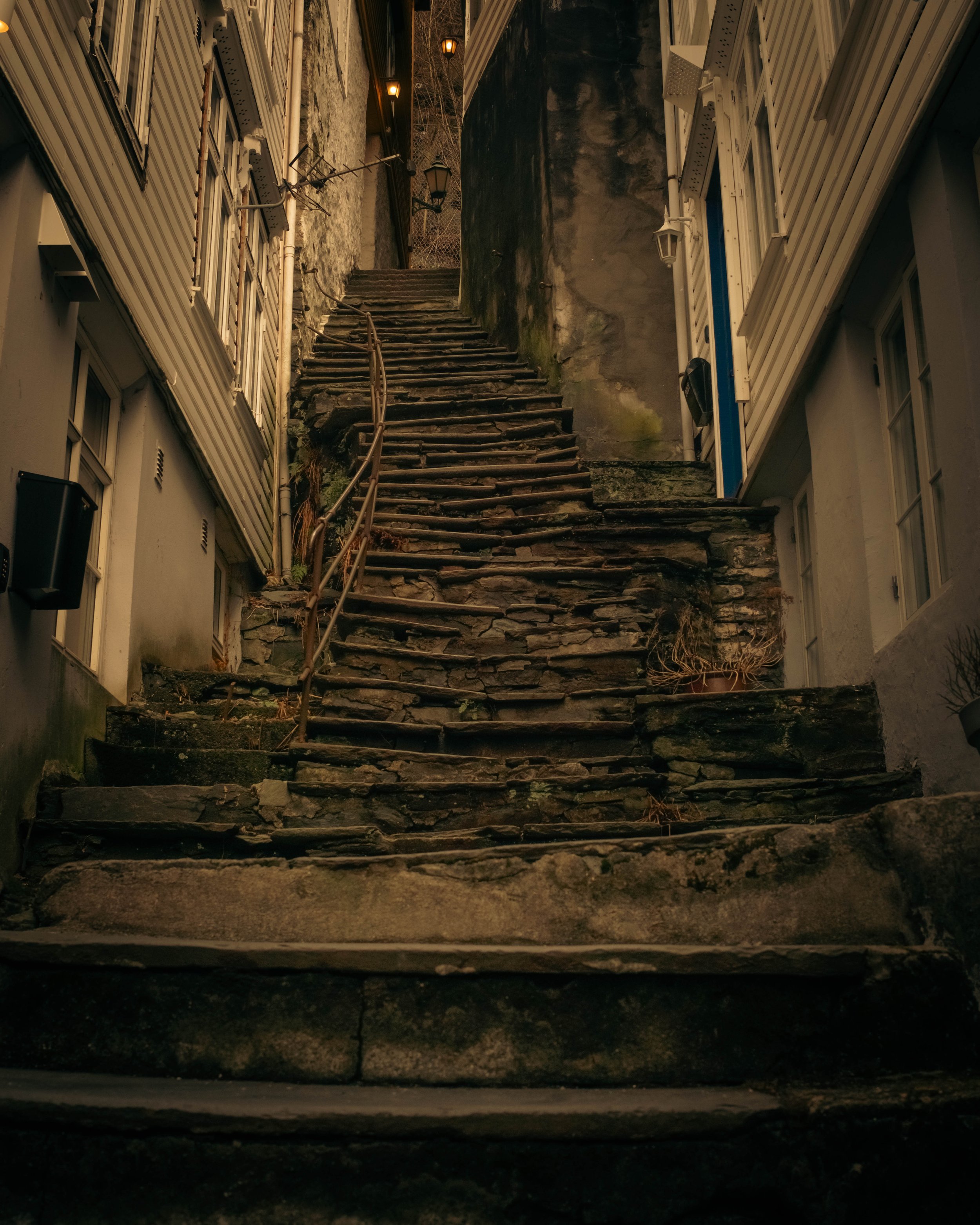
Walking the closes behind the facades, the medieval street pattern is entirely intact. Buildings from different centuries press against one another, and the colours that read as unexpectedly Mediterranean against mountain mist are a legacy of the same trading culture that moved goods and visual languages across the continent simultaneously. The residential streets climbing above the harbour follow the same compressed logic upward, stacked against the gradient in a way that makes the relationship between city and terrain completely legible from the outside.
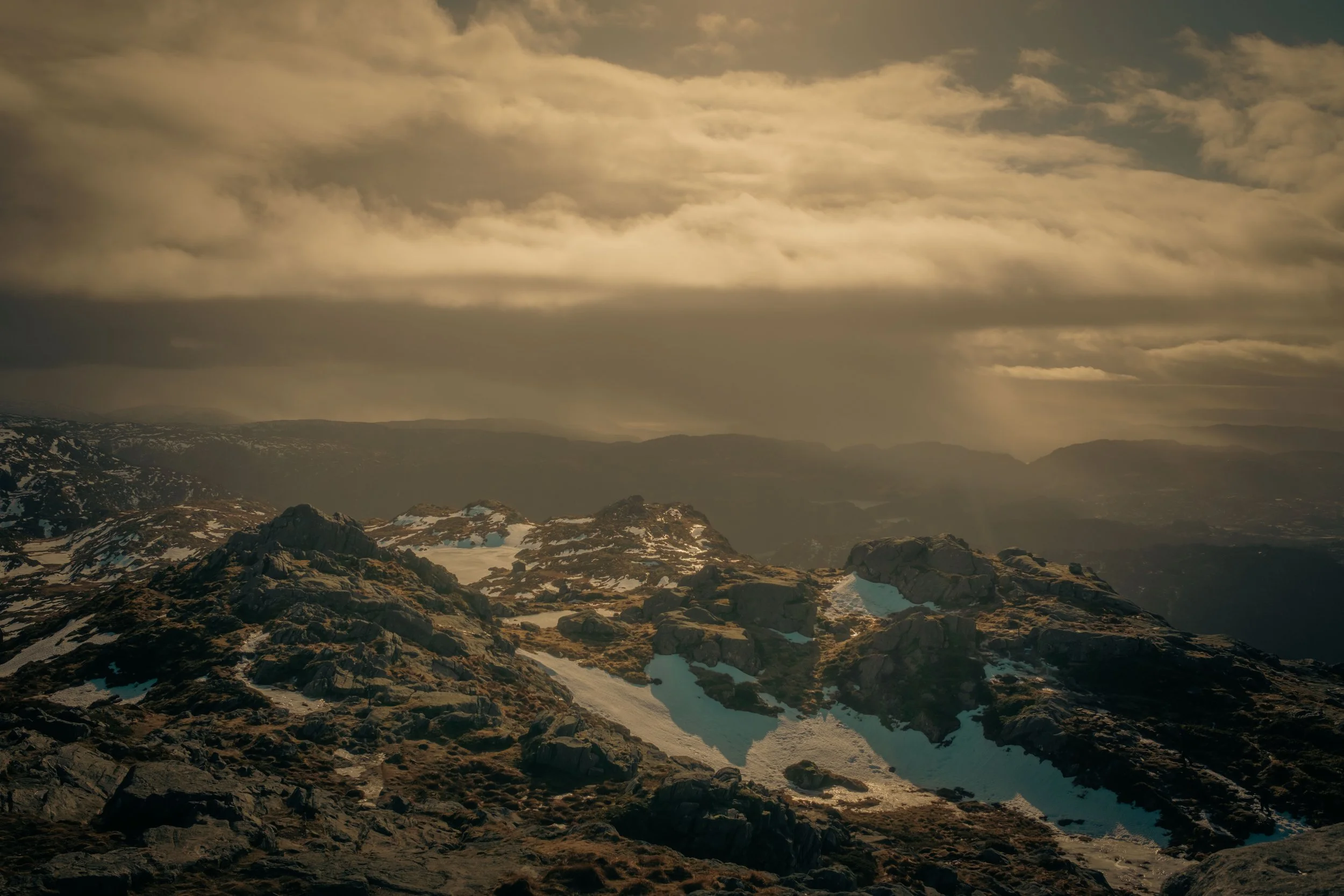
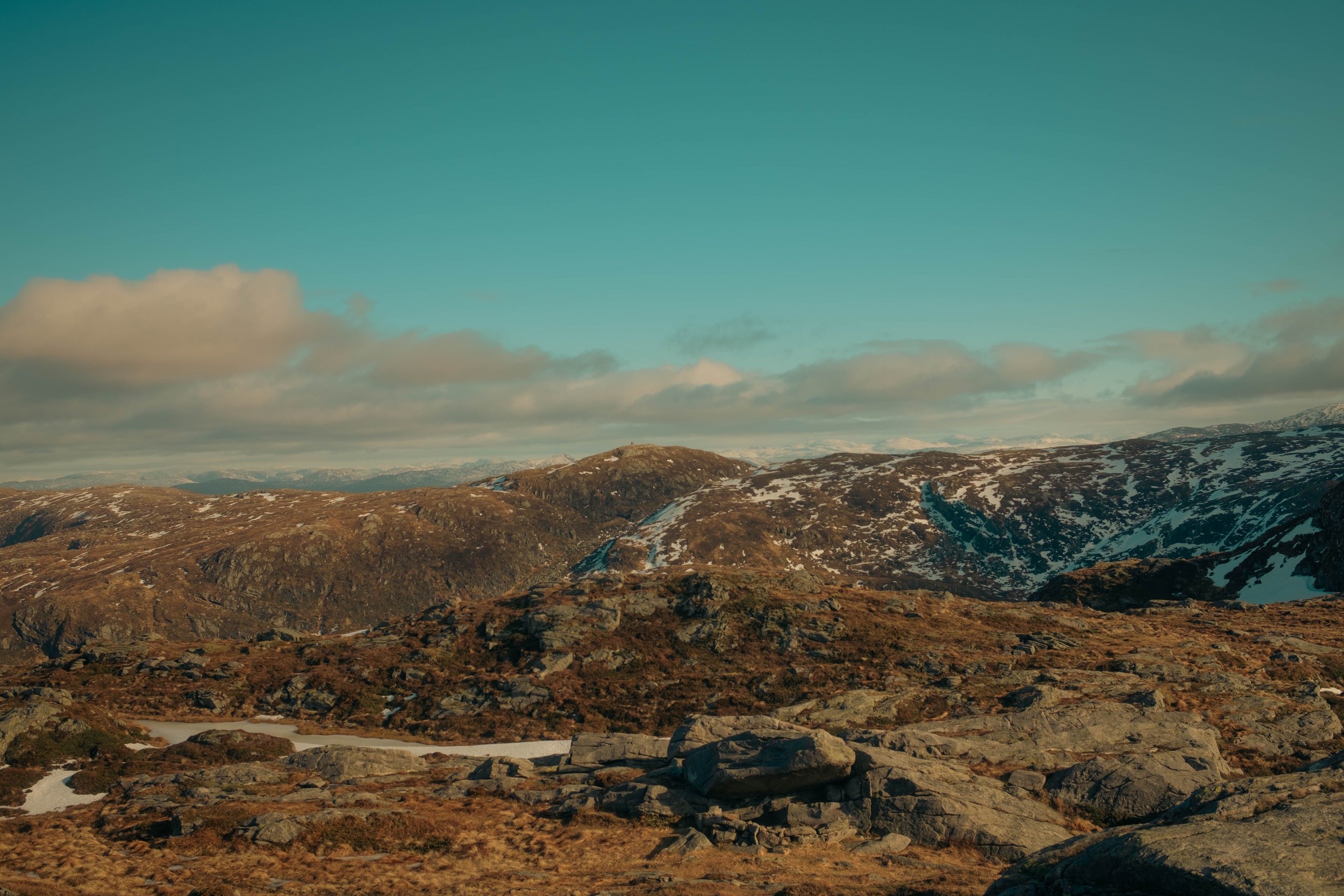
What Elevation Makes Visible
Ulriken rises to 643 metres above the city. From its summit Bergen falls into the fjords. The light at this elevation has a cinematic quality, and so does the weather. Golden hour was met with hail only moments after these images were taken.
For a studio working in hospitality and architectural photography, landscape gives context. The character of a city's light and terrain is present in every interior built within it, and Bergen's relationship to its mountains and water runs through the work we made there.
The Bergen People and Their Grand Hotel
De Bergenske translates, with the directness that suits this city, as the Bergen people. As a name for a hospitality group, it functions less as a brand than as a statement of provenance: the layered, historically dense, visually specific character of Bergen is the explicit point of the enterprise.
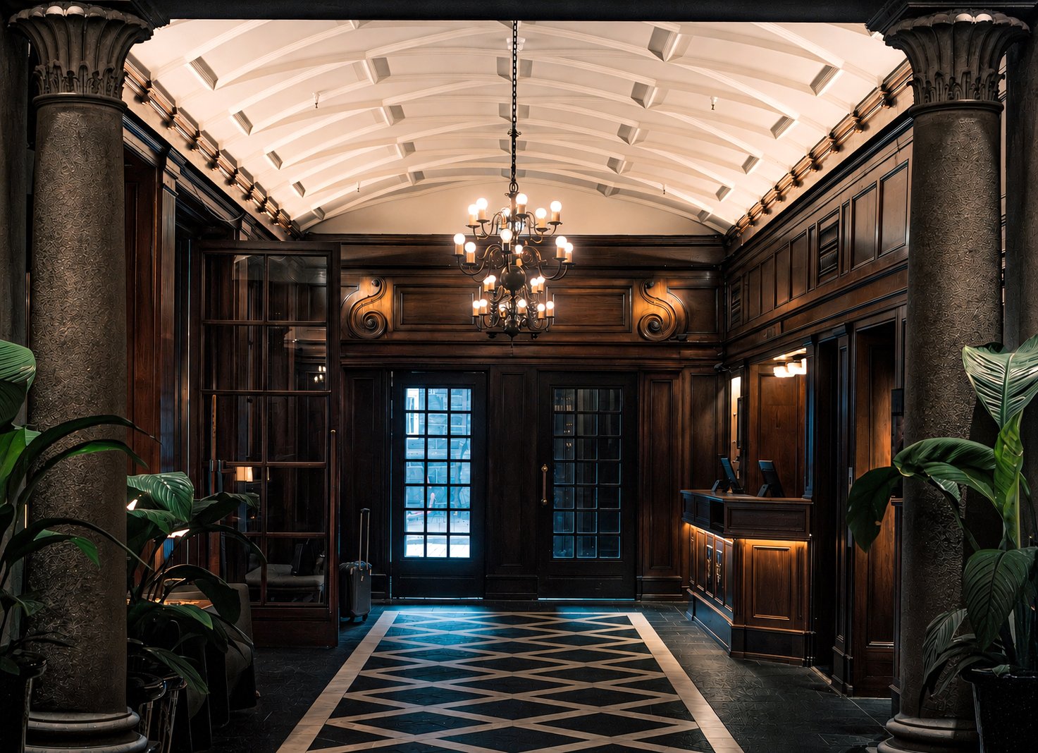
Grand Hotel Terminus was built in 1928 alongside Bergen Railway Station for the city's National Exhibition, always intended as a statement of civic ambition, artistry, and grandeur. Listed by the Directorate for Cultural Heritage in 2012 as an outstanding example of twentieth century hotel architecture, it has been in continuous operation for nearly a century. What distinguishes Terminus is not its age but what the property has done with that continuity.
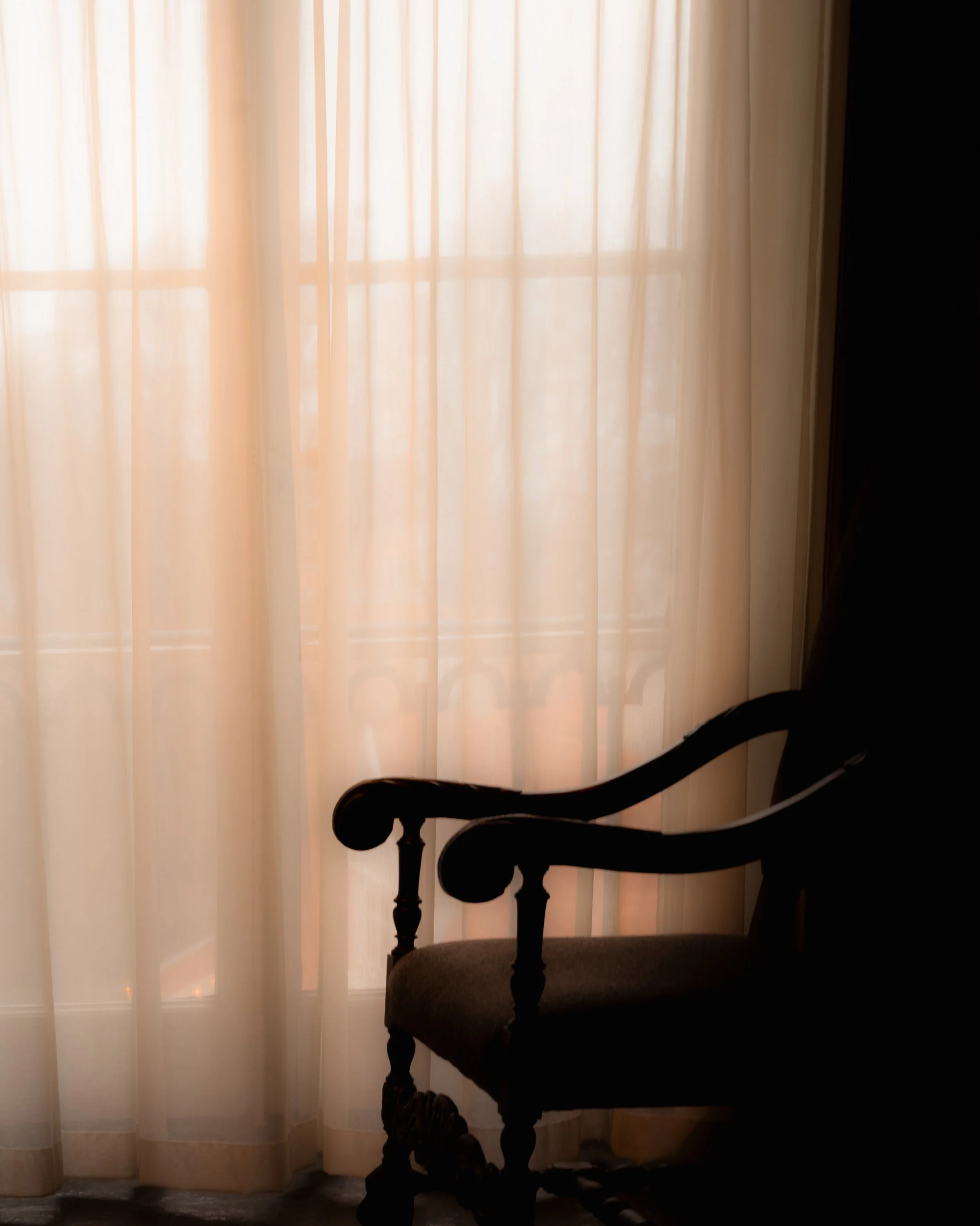
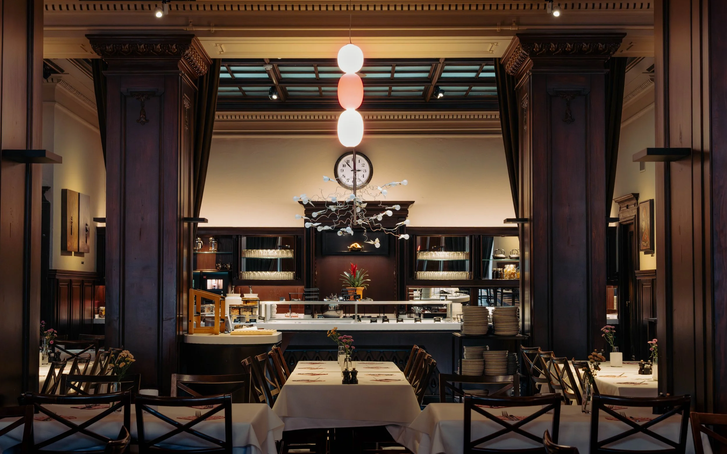
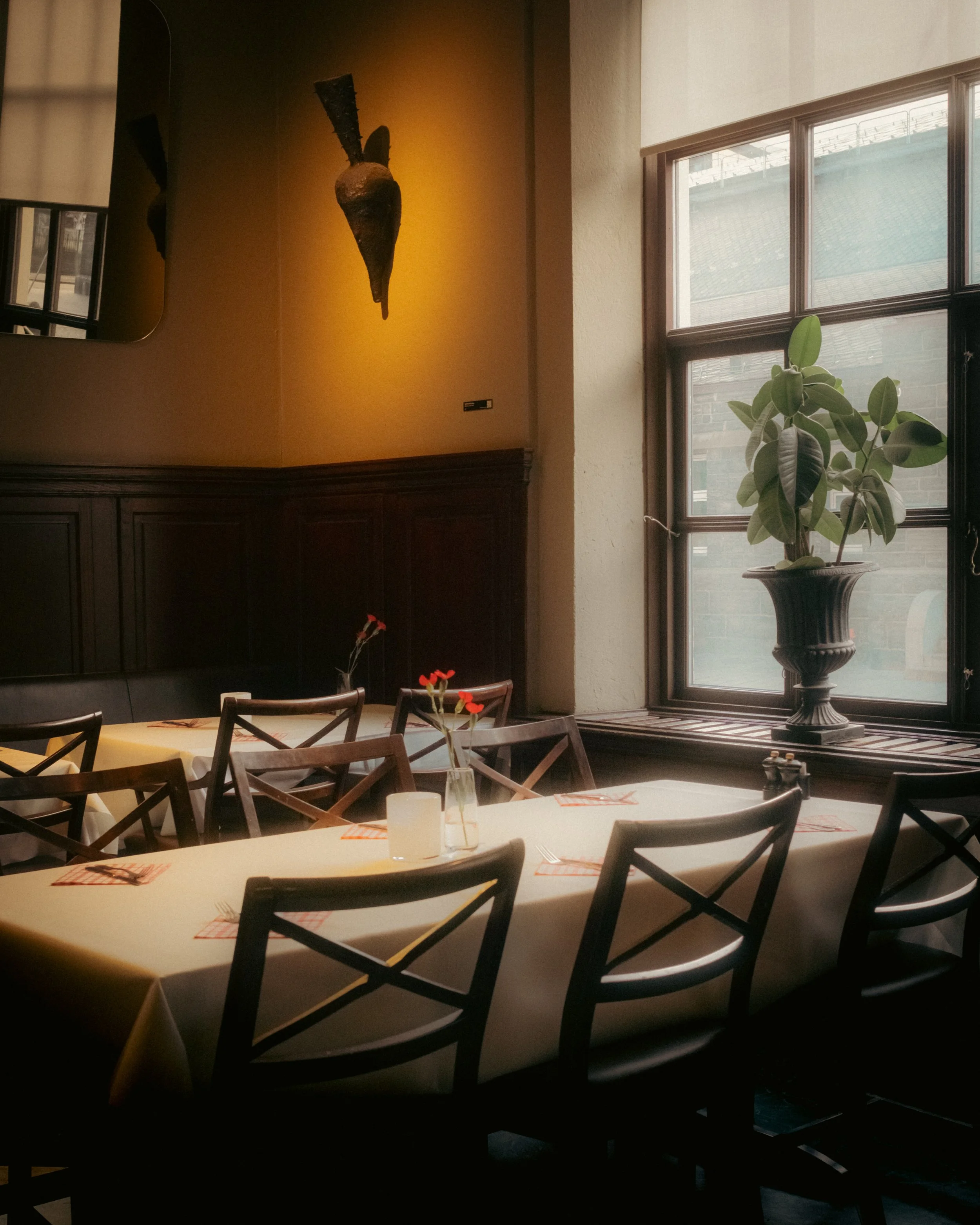
The dining hall is the epitome. Walnut wainscotting, red and white lanterns, light arriving through tall windows with the filtering in daylight with the quality of a Caravaggio. The collection on its walls spans postwar Norwegian printmaking and sculpture to contemporary craft, curated with the same deliberateness as the space itself. The contemporary lighting design chosen for the hall was selected with the same intention as the artworks beside it: art and interior in genuine conversation rather than decoration layered over architecture. The property's contemporary curation and its 1928 fabric read as a single sustained intention rather than layers accumulated over time.
Going beyond the Brochure
Every property has a visual presence. The question is whether it reflects what makes it worth choosing.
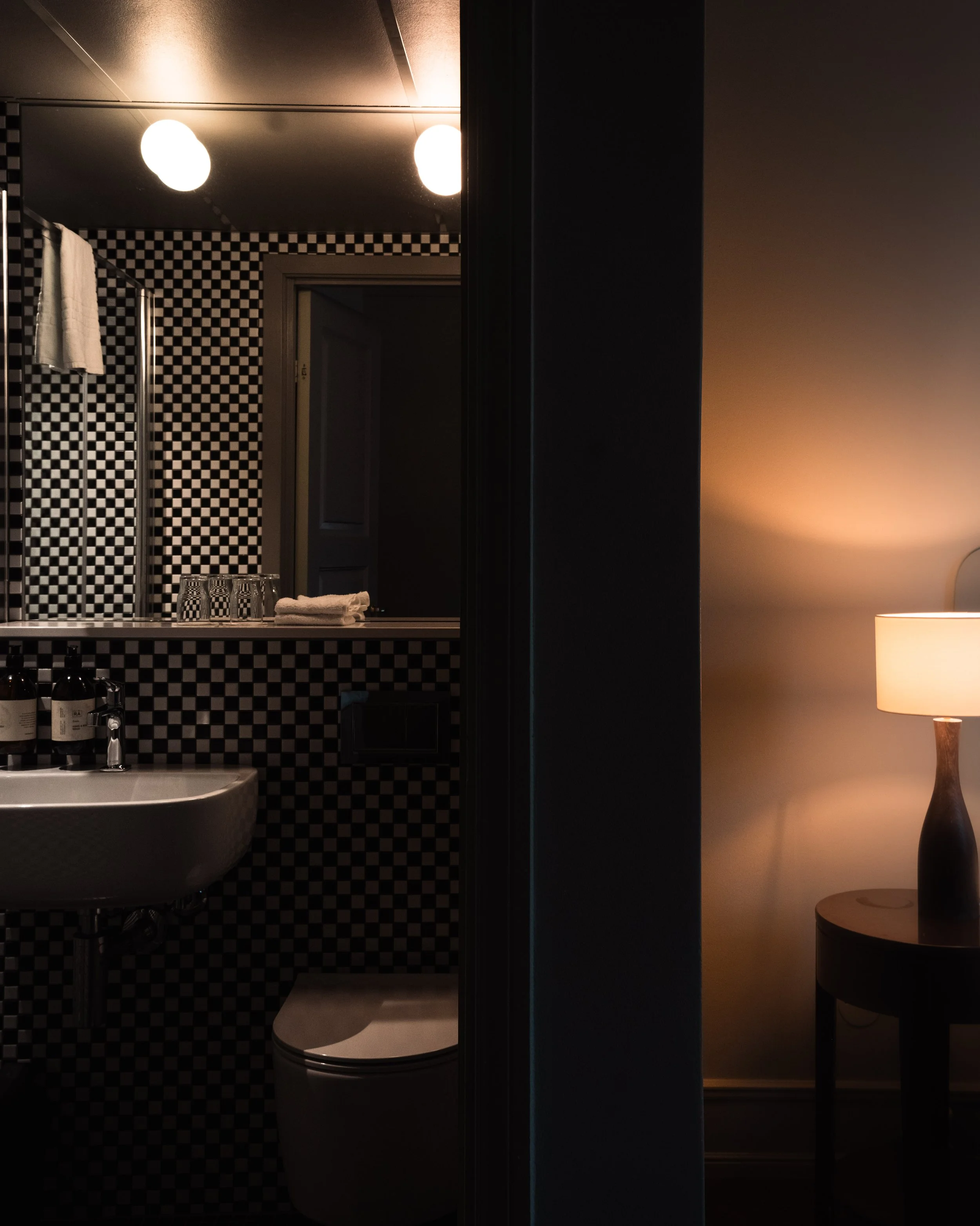
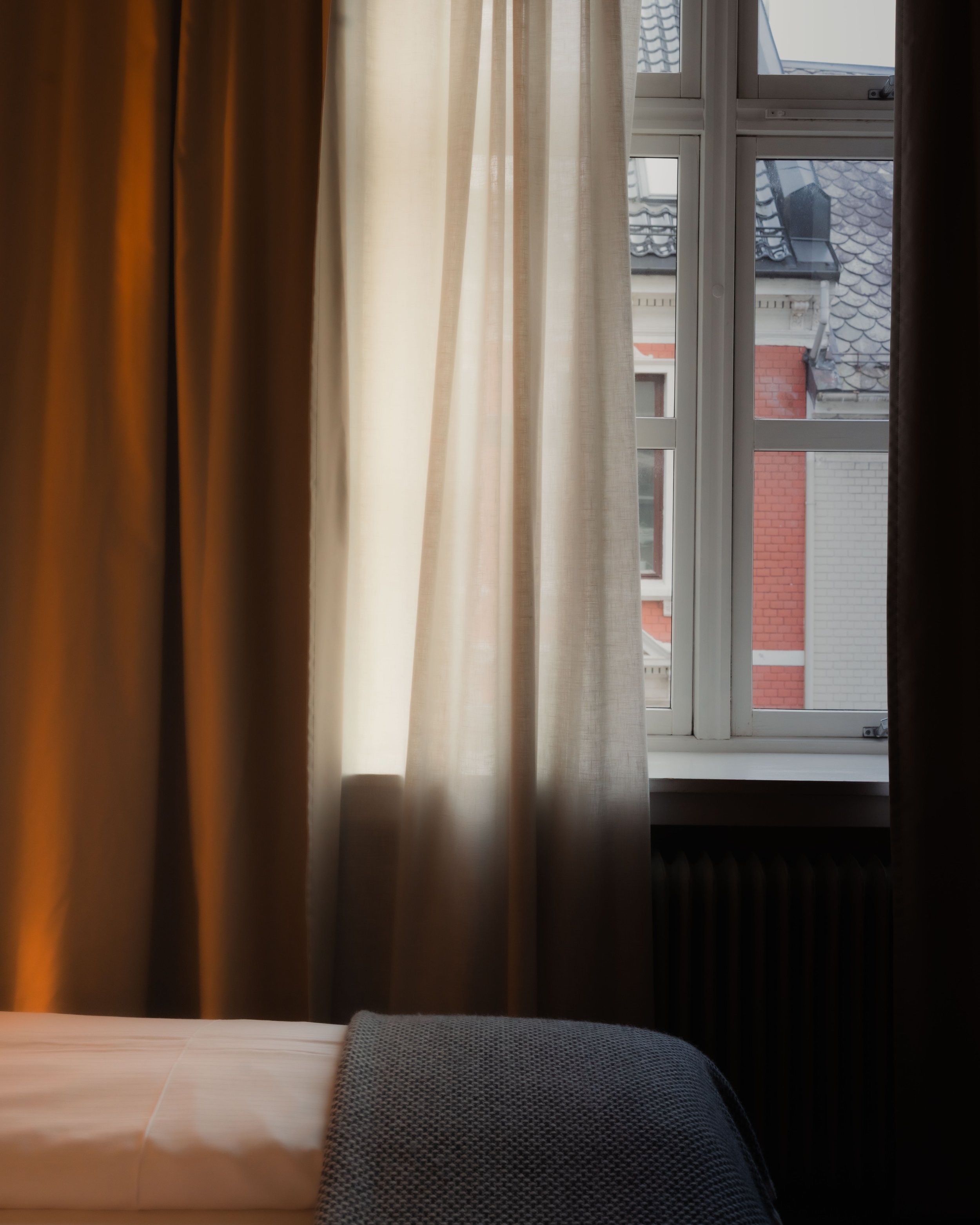
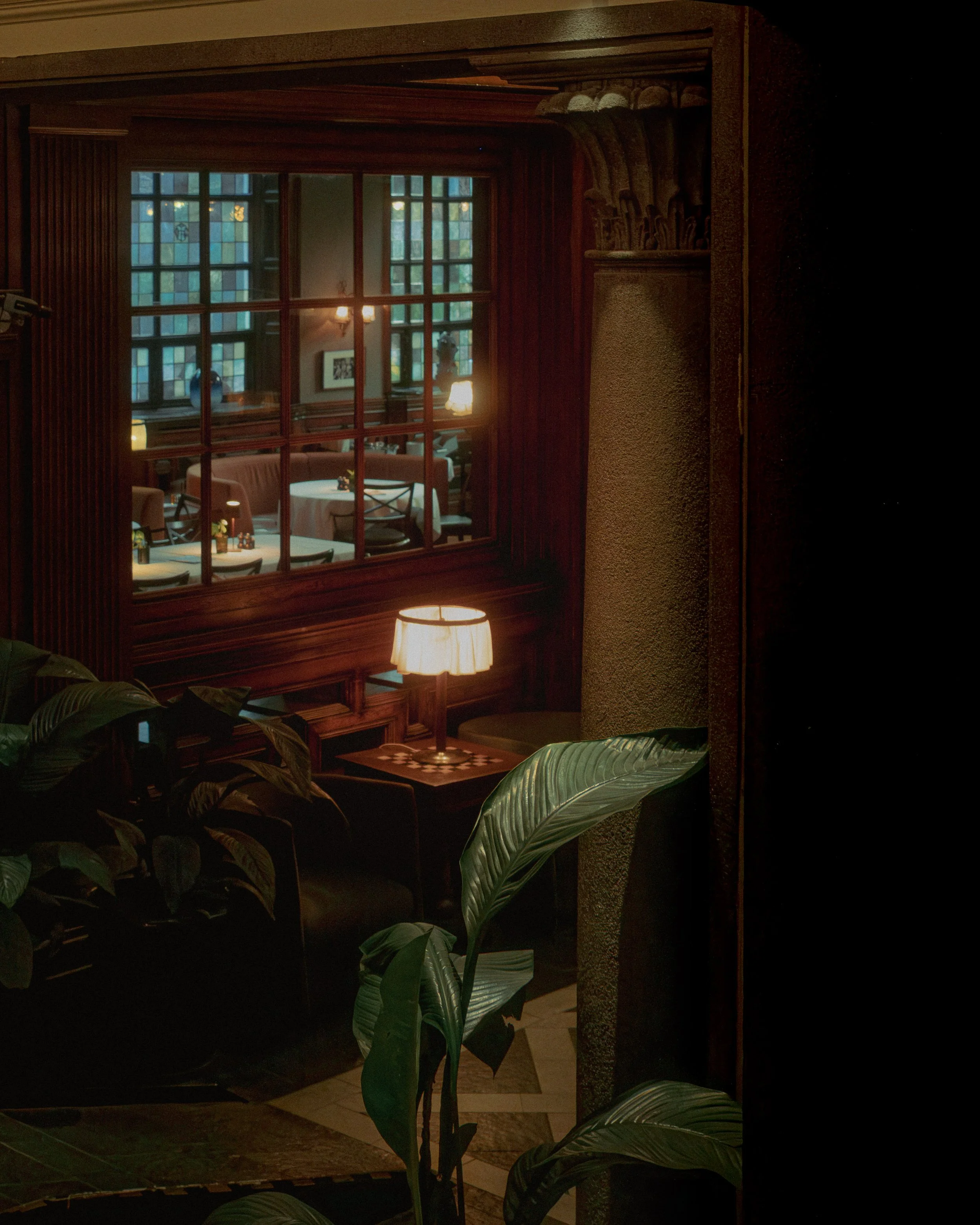
Atelier et al works with hotels, hospitality groups and PR agencies to build image collections that go beyond the functional. The light through a curtain at a particular hour. The detail at an entrance that concentrates everything a property wants to communicate. The stillness of a room before the first guest arrives. These are the images that generate desire for a place before anyone has experienced it in person.
The studio specialises in hospitality, architecture and interior photography, working across the UK, Europe and internationally. Our practice sits at the intersection of fine art and commercial photography, editorially driven, atmospherically considered, and built around the specific visual identity of each property we work with.
Every property has a visual identity worth communicating. Our work is finding it.